Blog Page Design for SEO: How Layout & UX Drive Traffic and Conversions
When businesses invest in content marketing, they usually focus on keyword research and writing high-quality articles. However, even the best content will fail if your blog page design is confusing, slow, or hard to read. Modern search engine optimization (SEO) goes beyond words on a screen; it depends heavily on page layout, mobile responsiveness, and user experience (UX).
If a reader clicks on your article and encounters a wall of text, intrusive popups, or a broken mobile layout, they will leave within seconds. This high bounce rate signals to search engines like Google that your page did not satisfy the user, causing your organic rankings to drop. To build a successful digital strategy, your blog page layout must be engineered for both human readers and search engine crawlers.
Table of Contents:
- What is an SEO Blog Page
- Blog Page Design for SEO
- How to Write & Structure Content
- Essential Design Elements
- Internal Linking Design
- Call-to-Action (CTA) Placement
- Common Blog Design Mistakes
- FAQ’s
What is an SEO Blog Page? (Content vs. Presentation)
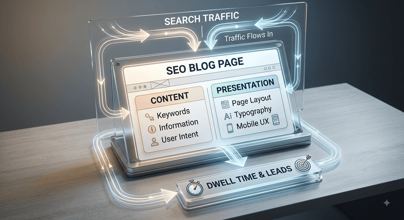
An SEO blog page is more than just a place to post news or articles. It is a strategically designed digital asset created to rank on search engine results pages (SERPs), answer specific user questions, and guide visitors toward taking action.
To understand how to build an effective blog page, you must divide it into two core components:
- Content (The Words & Information): This includes your keyword research, written content, images, data points, and answers to user intent. It provides the value that attracts visitors in the first place.
- Presentation (The Layout & UX): This involves the visual structure, font size, color contrast, page speed, mobile layout, and overall user interface. It determines whether visitors actually stay to read your content.
In modern search engine optimization, content and presentation cannot exist in isolation. You can write the most thorough guide in your industry, but if your presentation is poor, users will leave. Conversely, a visually stunning layout will not rank without strong content. Search engines measure how users interact with your presentation to determine if your content is truly valuable.
Why Website & Blog Page Design is Critical for SEO Performance
Search engines aim to deliver the best possible answer to a user's search query in the most comfortable format. When a user clicks your blog link, search engine algorithms track their behavioral signals:
- Dwell Time: How long a visitor stays on your page before returning to the search results.
- Bounce Rate: The percentage of visitors who leave after viewing only one page.
- Click-Through Rate (CTR): How many readers click on internal links or action buttons on your page.
If your blog design makes reading difficult, visitors will hit the back button within three seconds. This tells search engines that your page offered a poor user experience.
Furthermore, Google uses Core Web Vitals as official ranking signals. These metrics measure actual user experience parameters:
| Core Web Vital | What It Measures | Ideal Target | Design Impact |
|---|---|---|---|
| LCP (Largest Contentful Paint) | Loading speed of the main page content | Under 2.5 seconds | Uncompressed images and heavy scripts slow this down. |
| INP (Interaction to Next Paint) | How quickly the page responds to clicks/taps | Under 200 milliseconds | Heavy design animations and unoptimized code delay interaction. |
| CLS (Cumulative Layout Shift) | Visual stability of elements while loading | Under 0.1 | Images without fixed dimensions cause text to jump around. |
Additionally, modern AI engines (such as Google Gemini and SearchGPT) scan web pages to create instant summaries. A clean, well-structured blog layout allows these AI bots to easily parse your text, pull direct answers, and credit your website as a cited source.
How to Write & Structure Content for an SEO-Friendly Page
Structuring your blog content properly ensures that both human eyes and search engine crawlers can scan your information effortlessly.
1. Follow a Strict Heading Hierarchy (H1 → H2 → H3)
Use heading tags to organize your ideas logically.
- H1: Reserved exclusively for your primary Blog Title (only use one H1 per page).
- H2: Used for main subtopics and structural sections.
- H3: Used for sub-points beneath an H2 section.
This structural tree tells search engines how concepts on your page relate to one another.
2. Deliver the Direct Answer First
Place a concise, 2-to-3 sentence summary or direct answer right under your main headings or within your introduction. This design pattern satisfies high-intent searchers immediately and dramatically increases your chances of capturing Google's Featured Snippets and AI Overview placements.
3. Keep Paragraphs Short and Use Bold Text
Avoid long walls of text. Keep your paragraphs to 2–4 sentences at most. Use bold formatting on key phrases within paragraphs to allow visual readers to absorb the main points in seconds.
Essential Design Elements Every Blog Page Layout Needs
A high-converting, readable blog page combines several key visual design elements:
1. Clean Typography & Optimal Spacing
Reading on digital screens causes eye strain. Your layout must accommodate comfortable reading standards:
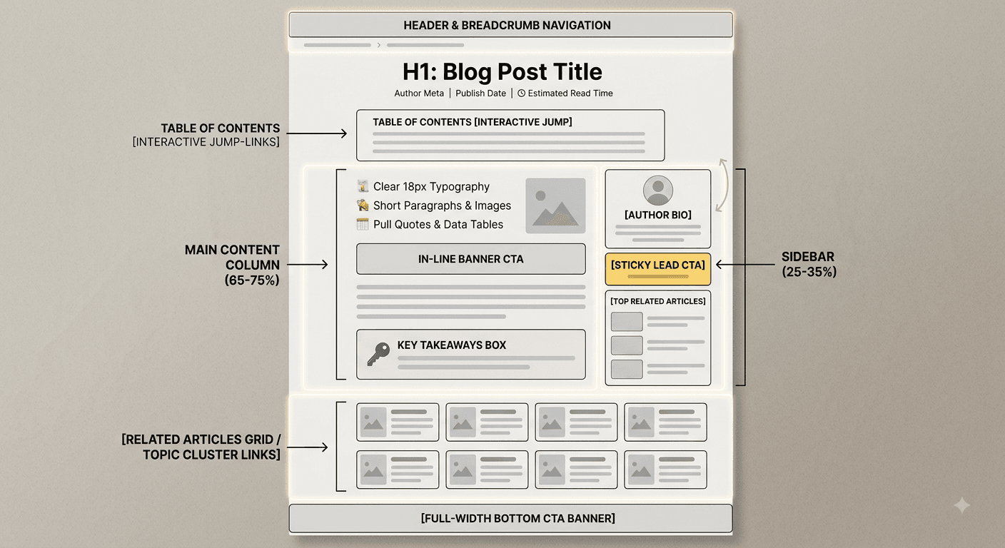
- Font Size: Set your body text to a minimum of 16px to 18px.
- Line Height: Maintain a line-height ratio of 1.5 to 1.8 for balanced line spacing.
- Line Length: Restrict the width of your text column to 50–75 characters per line. Columns that are too wide force the reader’s eyes to jump uncomfortably across large screens.
2. Interactive Table of Contents (ToC)
Include an automated, clickable Table of Contents near the top of your article. This helps readers jump directly to the section that answers their specific question. It also creates clickable "jump links" in Google search results, boosting your search listing footprint.
3. Visual Breakouts (Tables, Pull Quotes, & Callout Boxes)
Break up continuous reading with visual elements:
- Callout Boxes: Highlight key facts, warnings, or summaries.
- Data Tables: Compare technical information, pricing, or features clearly.
- Custom Graphics: Use labeled diagrams or real illustrations instead of generic stock photos.
4. Mobile Responsiveness and Touch Targets
Over 60% of web searches happen on mobile devices. Your blog layout must automatically adjust to smaller screen dimensions:
- Text should rescale without requiring horizontal scrolling.
- Clickable buttons and links must have tap targets of at least 48×48 pixels so mobile users can tap them easily without misclicking.
Internal Linking Design: How to Connect Related Blog Topics Naturally
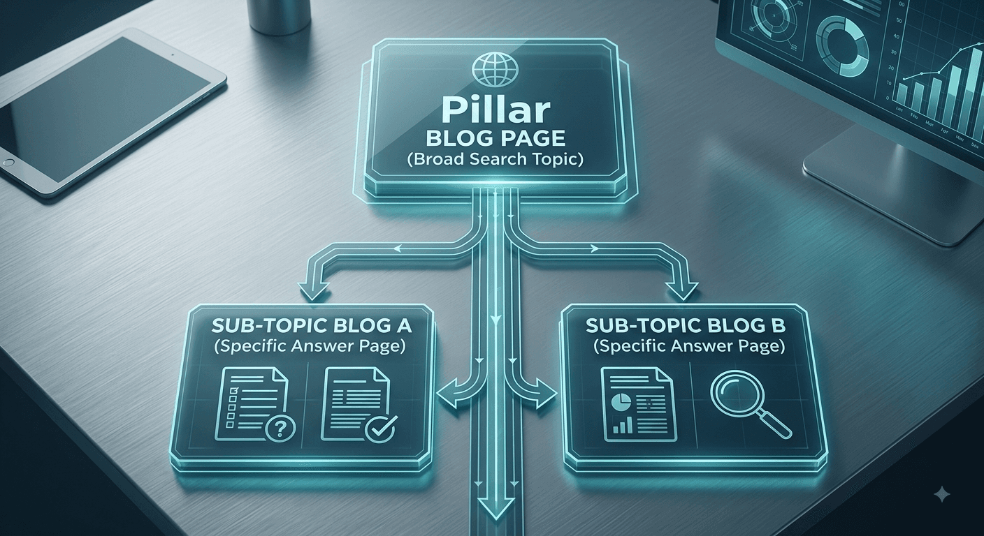
Internal links pass authority across your site, help search engines discover new pages, and keep users engaged longer. However, internal link placement requires thoughtful design:
Contextual In-Text Anchor Links
Integrate links directly into the flow of your writing. Use descriptive anchor text that explains where the link leads rather than generic phrases like "click here." For example, when building a scalable digital presence, partnering with an experienced seo company in calicut ensures your technical layout and content hierarchy align perfectly with search engine standards.
Related Articles Cards
Place a clean visual grid at the end of your article displaying 3 related blog posts. Using thumbnail images and descriptive titles encourages readers to continue exploring your website, turning a single page view into a multi-page session.
Call-to-Action (CTA) Placement: Where & How to Convert Readers
Traffic alone does not grow a business—conversions do. Your blog layout should incorporate a strategic path to guide readers from information gathering to taking action.
| CTA Type | Placement Location | Ideal Purpose |
|---|---|---|
| Sticky Header / Sidebar CTA | Fixed on the side or top bar during scroll | Lead magnet downloads, newsletter signups, or quick contact triggers. |
| In-Line Native CTA | Placed mid-article after a major section | Offering a direct service solution related to the problem just discussed. |
| Bottom Banner CTA | Placed directly after the article conclusion | Booking consultations or requesting custom project quotes. |
Designing CTAs for High Conversion
- Contrast: Use a button color that stands out cleanly against your blog background.
- Clear Value: Focus on what the user receives (e.g., "Get Your Free Audit" instead of "Submit").
- Avoid Intrusive Popups: Full-screen popups that appear immediately upon page load frustrate mobile readers and can trigger Google search penalties. Use delayed exit-intent popups instead.
If your current site struggles to convert traffic, working with a specialized website development company in calicut like DO Studio helps you design high-converting, custom blog layouts built on fast frameworks like WordPress or React.
Common Blog Design Mistakes That Kill Rankings & Conversions
- Uncompressed, Heavy Images: Uploading raw camera images slows down your page speed significantly. Always compress images and convert them to modern formats like WebP.
- Cluttered Sidebars: Filling sidebars with multiple ads, banners, and links distracts readers from your main article. Keep sidebars simple or test a clean, single-column design.
- Poor Color Contrast: Light gray text on a white background makes reading difficult and violates Web Content Accessibility Guidelines (WCAG).
- Missing Author Profiles: Failing to display author bios, credentials, and review dates undermines your site's E-E-A-T (Experience, Expertise, Authoritativeness, and Trustworthiness) signals.
Frequently Asked Questions
How does blog page design directly impact SEO rankings?
Blog page design directly influences user experience signals such as dwell time, bounce rates, and Core Web Vitals. If a poor layout causes users to leave quickly, search engines interpret this as a sign of low-quality content, which lowers your organic rankings over time.
What is the best font size for a readable blog page layout?
The recommended body text size for desktop and mobile reading is 16px to 18px, combined with a line height of 1.5 to 1.8. This ensures comfortable readability across different screen resolutions without causing eye strain.
Should I use a single-column layout or include a sidebar?
Single-column layouts are excellent for distraction-free, mobile-first reading. However, a layout with a clean right-hand sidebar works well on desktop if you want to display persistent CTAs, author information, or related resources without interrupting the main text.
Why is a Table of Contents important for a blog post?
A Table of Contents improves user navigation by allowing readers to jump directly to the information they need. It also creates jump links in search engine listings, improving your click-through rates on SERPs.
Turn Your Blog Design into a Growth Engine
Creating a successful SEO blog requires balancing informative writing with intuitive page design. By focusing on clean typography, responsive mobile layouts, fast loading speeds, and strategic CTA placement, you build a content ecosystem that ranks higher on search engines and turns casual readers into loyal customers.
If you are ready to optimize your web assets.
DO Studio offers complete digital marketing, SEO, and custom web development services tailored to your business goals. From initial layout strategy to technical optimization, our team helps build fast, high-converting digital experiences.
Contact DO Studio today to upgrade your online strategy.